
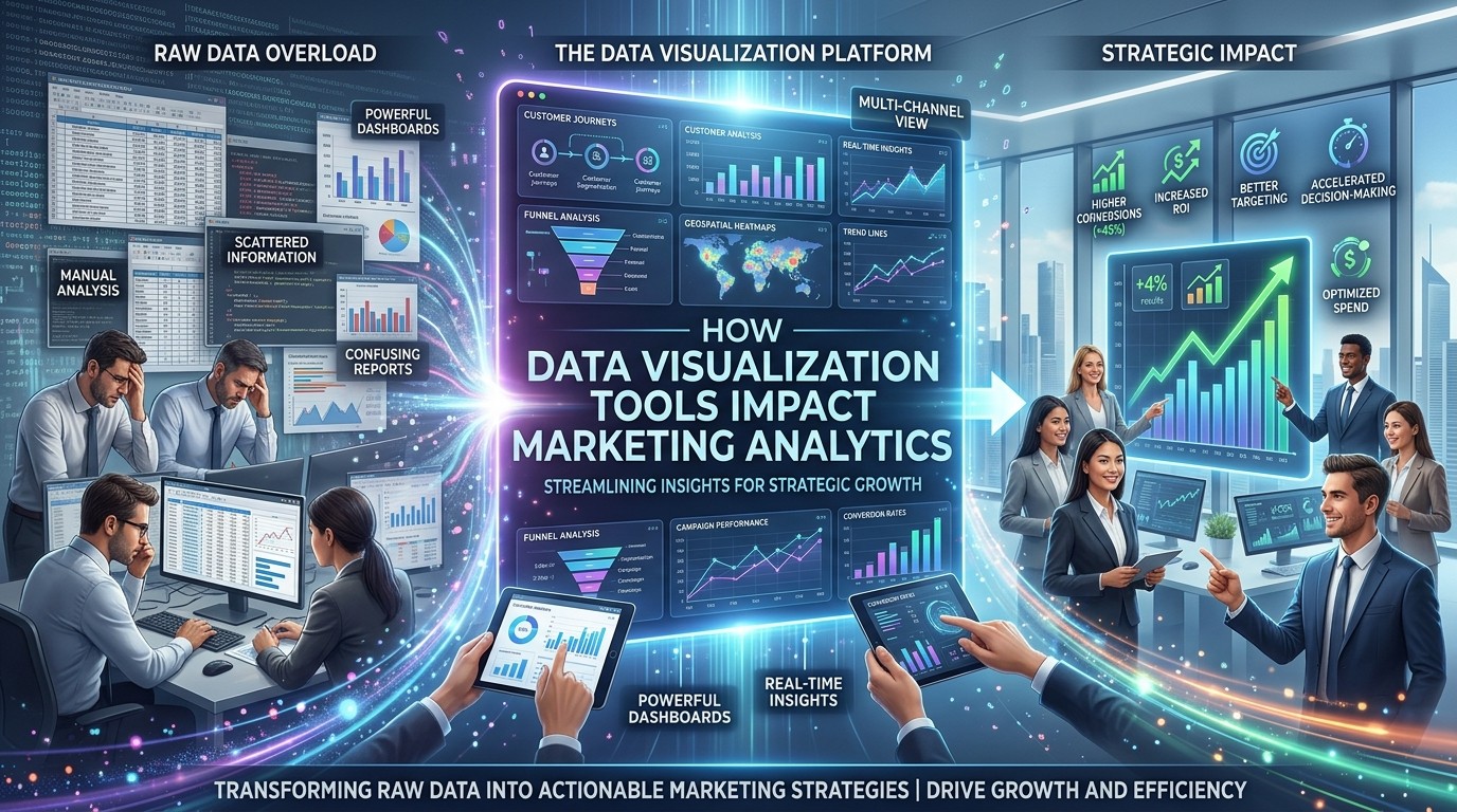
Data Visualization Tools transform scattered marketing metrics into clear, readable patterns, helping teams spot trends faster, explain results confidently, and make smarter decisions with less friction.
Marketing teams generate more data than ever before, yet more data does not automatically produce better decisions. In many organizations, the challenge is not collecting numbers but understanding what they mean. That is where Data Visualization Tools become valuable. They translate raw metrics into patterns that people can see quickly, compare easily, and act on with confidence.
A spreadsheet may contain accurate information, but accuracy alone does not create insight. People think visually, especially when they are under pressure to respond to campaign performance, budget changes, or customer behavior shifts. Data Visualization Tools reduce the mental effort required to interpret performance data. They help marketers see which channels are growing, which campaigns are losing steam, and which audiences are responding best.
The impact goes beyond speed. Data Visualization Tools also change how teams communicate. When sales, marketing, and leadership view the same dashboard, they are more likely to agree on what is happening and what should happen next. That shared understanding improves alignment and reduces endless debate over whose numbers are right.
A strong visual reporting system supports human psychology as much as it supports analytics. People trust what they can understand. They remember trends more easily than tables. They respond faster to visual evidence than to long reports. Data Visualization Tools work because they match the way the brain naturally processes information.
This is especially useful in fast-moving marketing environments where decisions cannot wait for a deep manual review. Campaigns need attention in real time. Content needs refinement. Budgets need adjustment. Data Visualization Tools give teams a practical way to move from observation to action without losing the bigger picture.
The best marketing strategies are not built on data alone. They are built on interpretation, context, and timing. Data Visualization Tools help connect those elements in a way that is simple enough for busy teams and detailed enough for analysts. That combination makes them one of the most important layers in modern marketing analytics.
Why Visual Reporting Matters in Marketing
Marketing analytics is meant to answer questions, not simply produce charts. The challenge is that many reports overwhelm users instead of helping them. Data Visualization Tools solve this problem by showing performance in a form that is faster to read and easier to remember.
Marketers rarely have time to study every metric line by line. They need to know what changed, where it changed, and why it matters. Data Visualization Tools make those answers visible through line charts, funnels, heatmaps, segment comparisons, and dashboards that simplify decision-making. When the format fits the question, insight appears sooner.
This matters because marketing decisions are often time-sensitive. A campaign may need an adjustment before the week ends. A content theme may need promotion if engagement drops. A channel may need more budget if it consistently converts. Data Visualization Tools shorten the path between a signal and a response, which makes the whole team more effective.
They also improve memory and retention. A well-designed chart stays in a person’s mind longer than a page of statistics. That means presentations become more persuasive and follow-up discussions become more focused. Data Visualization Tools do not just report numbers; they help those numbers influence action.
The Psychology Behind Visual Understanding

Human beings are wired to process images quickly. That simple fact explains why Data Visualization Tools are so effective. People can glance at a chart and immediately sense direction, contrast, or imbalance. Without visuals, the same insight may remain buried in rows of figures.
This matters in marketing because teams often experience information overload. Reports, dashboards, attribution notes, campaign summaries, and channel breakdowns can pile up fast. Data Visualization Tools reduce cognitive strain by organizing that volume into a clear pattern. Instead of asking people to remember dozens of numbers, they highlight the ones that matter most.
Psychology also plays a role in trust. People are more likely to believe information that is easy to interpret. If a report feels confusing, they may question the data or ignore the recommendation. Data Visualization Tools build confidence by making the evidence visible and intuitive. That can improve adoption across teams.
The emotional side matters too. When a team sees progress in a clear visual form, motivation rises. When a chart reveals a problem early, the team can respond before frustration grows. Data Visualization Tools therefore shape not only analysis, but also morale and momentum.
Core Benefits of Data Visualization in Marketing
There are several clear benefits that Data Visualization Tools bring to marketing analytics.
Faster interpretation
A line chart can show growth, decline, seasonality, or stagnation in seconds. Data Visualization Tools make it easier to understand what happened without reading long descriptions.
Better storytelling
Marketing teams often need to explain results to leaders, clients, or cross-functional partners. Data Visualization Tools help turn performance data into a clear narrative that supports decisions.
Easier prioritization
Not every metric deserves the same attention. Data Visualization Tools reveal which signals are strategic and which are minor, helping teams focus energy where it matters.
Stronger collaboration
When multiple people view the same visual report, it becomes easier to discuss the same issue. Data Visualization Tools reduce confusion and improve alignment across departments.
More efficient reporting
Recurring reports become easier to create and easier to consume. Data Visualization Tools save time by standardizing how performance is displayed.
Where to Start Visualizing Marketing Data
The best visual strategy begins with the questions a team asks most often. Data Visualization Tools are most useful when they answer real business questions rather than simply displaying everything that exists.
A good starting point is traffic. Teams should be able to see where visitors come from, how traffic changes over time, and which channels are growing. Data Visualization Tools can turn this into a simple trend view that is easy to compare across weeks or months.
The next priority is conversion. A funnel view can show where leads drop off and where progress slows. Data Visualization Tools are especially helpful here because they make weak points visible without requiring a long explanation.
Audience behavior is another strong use case. Teams can compare new versus returning visitors, segment performance, or engagement by device or geography. Data Visualization Tools make those differences easier to act on.
Content performance should also be visualized. Which pages bring the most engagement? Which assets lead to deeper sessions? Which formats create the strongest response? Data Visualization Tools help answer those questions clearly.
In broader planning, many teams combine this approach with Marketing Analytics Tools, because those platforms manage collection, attribution, and measurement while visuals help people interpret the results more effectively.
Table: Common Metrics and Best Visual Formats
| Metric | Best Visual Format | Why It Helps |
|---|---|---|
| Traffic over time | Line chart | Shows trends clearly |
| Channel comparison | Bar chart | Makes differences easy to spot |
| Funnel conversion | Funnel chart | Reveals drop-off points |
| Audience split | Stacked bar | Shows proportions well |
| Campaign ROI | KPI card + chart | Combines outcome and trend |
| Engagement intensity | Heatmap | Highlights behavior patterns |
This simple mapping shows why Data Visualization Tools matter. The right visual format can make a metric understandable almost instantly.
How Visualization Changes Decision-Making
Good decisions depend on good interpretation. Data Visualization Tools help teams interpret faster, which means decisions can happen sooner and with less uncertainty.
Imagine a campaign that generates plenty of clicks but weak conversions. A visual dashboard can show the imbalance quickly. Data Visualization Tools make that issue visible before the team wastes more budget. Another example is a content cluster that drives repeated visits. A visual report can highlight the pattern, encouraging the team to expand the topic area.
This does more than improve efficiency. It changes the style of decision-making. Teams become less reactive and more analytical. They ask better questions. They compare patterns instead of isolated numbers. Data Visualization Tools encourage that shift because they make the evidence easier to scan and discuss.
The effect is especially strong in meetings. Instead of reading data aloud, teams can look at a chart and discuss implications immediately. Data Visualization Tools therefore help meetings become shorter, more focused, and more productive.
Common Mistakes to Avoid
Visualization is powerful, but poor design can create confusion. Data Visualization Tools only help when the visuals are clear and intentional.
One common mistake is overloading dashboards with too many numbers. If everything is important, then nothing stands out. Data Visualization Tools should simplify, not clutter. Another mistake is using the wrong chart type. A pie chart may work for part-to-whole comparison, but not for trend analysis. Data Visualization Tools work best when the format matches the message.
Another issue is outdated reporting. A dashboard that is not updated regularly can mislead teams into making old decisions based on old data. Data Visualization Tools lose value if they are not maintained.
Some teams also focus too much on design polish and not enough on usefulness. A pretty dashboard that does not answer the right question is still ineffective. Data Visualization Tools should always be judged by their ability to guide action.
Building Trust Through Clarity
Trust is one of the most important outcomes of good analytics. When people understand a report, they trust it more. Data Visualization Tools improve that trust by making the logic visible.
A clear dashboard shows the same story to everyone. That matters because teams often interpret data differently when the format is messy. Data Visualization Tools create a shared reference point, which reduces debate and speeds up consensus.
They also make it easier to explain performance to people who are not analysts. A leader does not need to study every row of data to understand whether a campaign is healthy. Data Visualization Tools translate the information into a format that is easier to absorb and remember.
That clarity can influence confidence across the organization. Teams are more willing to act when they understand the evidence. Data Visualization Tools therefore support both communication and execution.
How Visualization Helps Attribution
Attribution is one of the hardest parts of marketing analytics because customers move through complex journeys. Data Visualization Tools help simplify that complexity.
A visual attribution model can show how channels work together across the path to conversion. It can reveal whether paid search introduces interest, whether email nurtures it, and whether organic content supports the final decision. Data Visualization Tools help teams see that interaction more clearly than a table of touchpoints ever could.
This is especially useful when budgets need to be allocated. If one channel consistently assists conversions, it may deserve more credit and more investment. If another channel drives traffic but not meaningful progress, it may need a new strategy. Data Visualization Tools help leaders make those tradeoffs with more confidence.
They also support experimentation. If a team changes a campaign message or landing page, visualization can help show whether the change improved engagement or conversion. That makes testing more actionable and less abstract.
Choosing the Right Platform
Different teams need different levels of depth, flexibility, and ease of use. Data Visualization Tools should be selected based on the questions a team needs to answer and the people who will use them.
First, consider usability. If the dashboard is difficult to read, adoption will be weak. Data Visualization Tools must feel intuitive enough for marketers, not just analysts. Second, consider integration. The best systems can connect to the data sources that matter most. Third, consider flexibility. Teams often need to switch between executive summaries and detailed drill-downs. Data Visualization Tools should make that transition easy.
It also helps to compare related systems when planning a stack. Many organizations review Top 5 Digital Analytics Tools while looking for the best reporting environment, but the final choice should depend on workflow, audience, and performance goals. Data Visualization Tools become most valuable when they fit naturally into daily use.
Why Visualization Supports Strategy
Strategy is easier when leaders can see the shape of performance. Data Visualization Tools show whether growth is broad or narrow, whether conversion is improving or weakening, and whether one segment is outperforming the rest.
This makes strategic planning more precise. Teams can identify where to invest, what to adjust, and which channels need less emphasis. Data Visualization Tools reduce uncertainty by turning scattered metrics into clear priorities.
The strategic impact is even greater when teams work with Inbound Marketing Tools. Inbound programs attract and nurture attention over time, and visuals help show which content paths and entry points are creating the strongest momentum. Data Visualization Tools make those patterns easier to compare and act on.
Where Visualization Has the Biggest Impact
There are a few marketing areas where Data Visualization Tools consistently create the most value.
Campaign analysis
Visuals make it easier to see which campaigns are performing and which need improvement.
Funnel analysis
A funnel visual shows where users drop away and where progress is strongest.
Content analysis
Charts help teams understand which topics, formats, or pages are producing the best response.
Executive reporting
Leadership needs concise summaries. Data Visualization Tools make reporting easier to absorb and discuss.
Cross-channel comparison
When multiple channels are active, visuals help compare performance without losing context.
The Human Side of Analytics
Marketing analytics is often treated as a technical discipline, but the real audience is human. People want to understand uncertainty, opportunity, and progress. Data Visualization Tools help by making that understanding less stressful.
When a team sees a clear pattern, action feels easier. When the report is confusing, people delay or disagree. Data Visualization Tools reduce that friction by turning data into a readable story. That story can support faster alignment and better decisions.
This is especially important in fast-moving teams where people are already managing multiple priorities. Data Visualization Tools allow them to focus on what the data is saying rather than how to decode it.
The Link Between Visualization and Performance
Performance improves when insight is easier to use. Data Visualization Tools support performance by revealing what is working, what is not, and what is changing over time.
A chart can quickly show whether a new campaign is getting traction. A dashboard can reveal if a landing page update improved conversion. A segment comparison can show whether one audience is more valuable than another. Data Visualization Tools help teams identify those patterns quickly enough to do something about them.
This is one reason many advanced teams pair visualization with Advanced B2B Marketing Tools. B2B journeys are often long and multi-touch, so visual reporting is essential for understanding which actions matter most. Data Visualization Tools provide the visibility that makes that complexity manageable.
Effective Dashboard Design

A good dashboard should answer a few key questions immediately. What happened? How does it compare with last period? Where is the biggest change? What should the team look at next? Data Visualization Tools are strongest when they help answer those questions in one place.
Good design also respects hierarchy. The most important metrics should appear first. Supporting details should be available but not overwhelming. Data Visualization Tools should guide attention rather than compete for it.
Labels and context matter too. A chart without a title, date range, or comparison point can be misleading. Data Visualization Tools become more credible when the viewer understands exactly what is being shown.
How to Create a Better Data Culture
Tools are only part of the solution. A strong data culture is what makes analytics useful over time. Data Visualization Tools contribute to that culture by making information more approachable.
When teams check dashboards regularly, they begin to think in trends instead of isolated events. When they use the same visuals in planning meetings, they begin to share a common language. Data Visualization Tools help create that habit.
A good data culture also encourages questions. If a chart looks unusual, the team should investigate instead of guessing. Data Visualization Tools make that investigation easier by exposing patterns quickly.
Looking Ahead
Marketing analytics will continue to become more complex, but the need for clarity will remain constant. Data Visualization Tools will matter even more as teams manage larger data sets, more channels, and faster decision cycles.
Future systems are likely to become more interactive and predictive. Instead of only showing what happened, they will help forecast what may happen next. Data Visualization Tools will stay central because human beings still need a clear way to understand the story behind the numbers.
Teams that adopt strong visual reporting practices now will be better prepared for that future. They will already know how to interpret patterns, discuss findings, and use insights in everyday decisions.
Conclusion
Data Visualization Tools have a direct and lasting impact on marketing analytics because they make information easier to understand, share, and act on. They reduce cognitive strain, improve collaboration, support stronger attribution, and help teams move from raw numbers to practical decisions with greater speed. When visual reporting is done well, it creates confidence, clarity, and better alignment across the entire marketing process. As data volumes grow and customer journeys become more complex, the teams that rely on clear visual interpretation will be better equipped to adapt, optimize, and grow with consistency.
Frequently Asked Questions (FAQ)
1. What are Data Visualization Tools?
Data Visualization Tools are software solutions that turn raw data into charts, dashboards, graphs, and other visual formats that are easier to interpret.
2. Why are Data Visualization Tools important in marketing analytics?
They help marketers understand trends quickly, compare performance clearly, and make faster decisions based on visible patterns.
3. How do Data Visualization Tools improve reporting?
They turn complicated numbers into easy-to-read visuals, which makes reports more useful for both analysts and decision-makers.
4. What is the biggest benefit of visual analytics?
The biggest benefit is clarity. Data Visualization reduce confusion and help teams focus on the most important insights.
5. Can Data Visualization Tools improve campaign performance?
Yes. They help teams identify what is working, what is underperforming, and where adjustments should be made.
6. Are Data Visualization Tools useful for leadership teams?
Absolutely. Leaders often need quick summaries, and visuals make it easier to understand performance without reading long reports.
7. How do these tools relate to Marketing Analytics Tools?
Marketing Analytics Tools collect and measure data, while Data Visualization help people interpret and act on that data more effectively.
8. Why mention Top 5 Digital Analytics Tools here?
That phrase is often used when teams compare platforms, because the best reporting setup depends on the workflow and the team’s needs.
9. How do Inbound Marketing Tools connect to visualization?
Inbound Marketing Tools attract and nurture interest, and visual reporting helps show which content and channels are driving the strongest response.
10. Why are Data Visualization Tools especially helpful in Advanced B2B Marketing Tools?
B2B journeys are often long and complex, so visual reporting makes it easier to track progression, compare channels, and understand influence across the funnel.


